Working with Tooltips
A tooltip is a message which appears when the end-user hovers over a data point in a dashboard visualization.
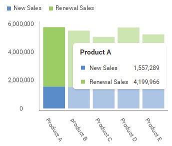
Tooltips are shown on hover for every visualization type that supports them - charts, pie, funnel and treemap visualizations, maps, grids and data charts. Tooltip actions, such as drill down or filtering, are available directly from the tooltip without an extra click. Tooltips will follow as the mouse cursor moves over the visualization's data. Once the mouse momentarily stops moving, the tooltip will become anchored, allowing access to the actions contained in them.
Hover tooltips were previously available behind a beta feature flag, enabled as "newTooltip" or through the BetaFeatures.newTooltips constant. They are now the default tooltip experience and the beta flag has been removed - you no longer need to enable anything to get them, and any remaining call that enables the flag can be deleted.
When a tooltip is showing in a dashboard visualization, the RevealView.onTooltipShowing event is invoked. Handling this event will allow you to read tooltip data, or prevent the tooltip from showing
revealView.onTooltipShowing = (args) => {

};
The TooltipShowingEventArgs contains the following properties:
- cell - gets the data point that is associated with the tooltip
- row - gets a collection of cell data that is provided in the tooltip
- visualization - gets the Visualization displaying the tooltip
- cancel - set to
trueto prevent the tooltip from being displayed - customItems - a collection of
RVTooltipItemobjects used to add custom menu items to the tooltip
The RevealView.onTooltipShowing event will not be triggered for visualizations that do not support tooltips, such as gauges.
Showing and Hiding Tooltips
Use the RevealView.showTooltips property to turn tooltips on or off for every visualization in the dashboard. The property defaults to true.
import { RevealView } from "reveal-sdk";

const revealView = new RevealView("#revealView");
revealView.showTooltips = false;
The property can be changed at any time and the visualizations update immediately, so you can also toggle it at runtime.
document.getElementById("toggleTooltips").addEventListener("click", () => {
    revealView.showTooltips = !revealView.showTooltips;
});
showTooltips controls tooltips that are triggered by hovering a data point. Tooltips triggered by clicking or tapping a data point are always displayed, as touch devices have no hover events.
If you are using the Reveal SDK in a .NET MAUI application, the equivalent property on the RevealView control is ShowTooltips.
Migrating from hoverTooltipsEnabled
The showTooltips property replaces hoverTooltipsEnabled. The old name was specific to chart visualizations, while the setting now gates tooltips for every visualization type that supports them.
//deprecated
revealView.hoverTooltipsEnabled = false;

//use this instead
revealView.showTooltips = false;
hoverTooltipsEnabled still works and forwards to showTooltips, so existing code continues to run. It is deprecated and will be removed in a future release - update to showTooltips when you get the chance. The same applies to the HoverTooltipsEnabled property in .NET MAUI applications.
Reading Tooltip Data
By using the properties exposed by the event TooltipShowingEventArgs object, such as the TooltipShowingEventArgs.cell and TooltipShowingEventArgs.row properties, you can read data that is used for display in the tooltip.
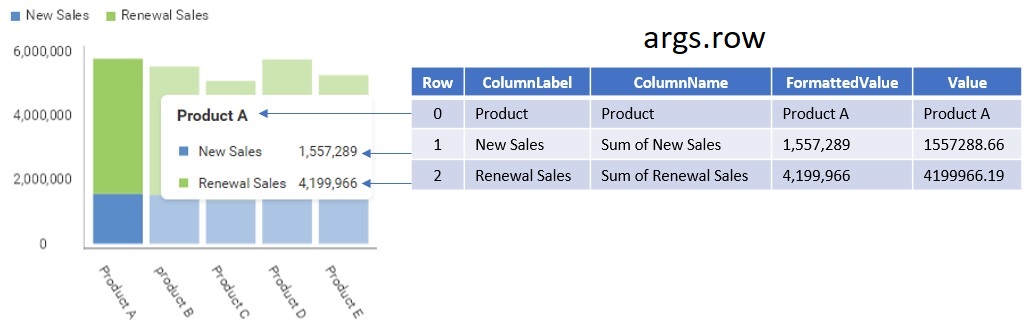
It's important to understand that the TooltipShowingEventArgs.row property provides a collection of RVCell objects that represent each data point in the tooltip.
The RVCell class has the following properties:
- columnLabel - the label, or custom name, of the column belonging to the data point
- columnName - the name of the column belonging to the data point
- formattedValue - the formatted value of the data point
- value - the original value of the data point
The following image illustrates how the properties of a RVCell maps to the data being displayed in the tooltip.
Prevent Tooltips from Showing
To prevent tooltips from showing for all visualizations, or a specific visualization, simply set the TooltipShowingEventArgs.cancel property to true.
In this example, we are checking if the TooltipShowingEventArgs.visualization.title property is Sales and preventing the tooltip from showing by setting the TooltipShowingEventArgs.cancel property to true.
revealView.onTooltipShowing = (args) => {
    if (args.visualization.title == "Sales") {
             args.cancel = true;
    }
};
Adding Custom Items to the Tooltip
Use the TooltipShowingEventArgs.customItems collection to add your own menu items to the tooltip. Each item is an RVTooltipItem, created with a group header, a title, an icon, and a click handler.
import { RVTooltipItem } from "reveal-sdk";

revealView.onTooltipShowing = (args) => {
    args.customItems.push(new RVTooltipItem("Actions", "View Details", null, (sender, e) => {
        console.log("View Details clicked", e);
    }));
};
The icon argument accepts either a URL string or an RVImage instance, and may be null when no icon is needed.
The source code to this sample can be found on GitHub